Project Overview
February 2024 – March 2024
Product
This app, Monordus (“moneta” means money; “ordo” means order), is designed to cater to users of all ages and genders, providing them with a simple yet effective tool to track their spending habits. Users can easily record each expenditure and organize these entries into specific categories, allowing for a clearer understanding of their financial patterns and better management of their budget.
Role & Responsibilities
Research
User Research Summary
In conducting user research for my budgeting app, I initially assumed that users would prioritize simplicity and ease of use in navigating the interface, and that they would predominantly use the app to track personal expenses rather than complex financial management. I conducted interviews and surveys with a diverse group of potential users spanning different ages and genders. Through my research, I discovered that while simplicity was indeed important, users also valued customization features that allowed them to tailor spending categories to their specific needs. Additionally, I found that users desired robust reporting functionalities to gain insights into their spending habits over time. These insights prompted us to adjust our assumptions, emphasizing the need for a balance between simplicity and customization, along with the integration of comprehensive reporting tools to better meet user needs.
User Pain Points
Meet the Users


User Journey Map
My next step involved illustrating how my personas were currently performing their tasks.

Starting the Design
The New User Flow

Sketch Wireframes


Low-Fidelity


Usability study: Round 1
With a combination of moderated usability study and unmoderated usability study, users were asked to follow basics navigation of the app and provided feedback on overall experiences.
Mid-Fidelity
After completing Usability Round 1, the Mid-Fidelity prototype is refined based on initial user feedback. It represents a more polished version of the product with improved functionality, layout, and interaction design. There key features are:
• Users can easily adjust categories by clicking on the category table within the Transaction page.
• The wheel visually represents the current balance and breaks down the amounts allocated to each category.
• Categories are color-coded for quick identification.
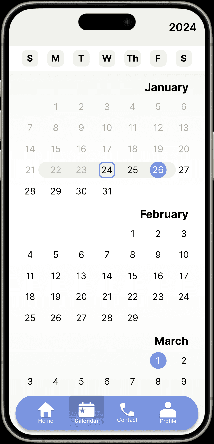
• Users can now view different years on the History page.

Refining the Design
Usability study: Round 2
With a combination of moderated usability study and unmoderated usability study, users were asked to follow basics navigation of the app and provided feedback on overall experiences.
Final-Iteration
After completing Usability Round 2, the Mid-Fidelity prototype was refined based on initial user feedback. Colors have been adjusted to create a clearer visual hierarchy. The balance wheel and categories have been updated for improved readability. Additionally, the add items button has been integrated into the bottom navigation bar to reduce visual clutter. Users can now view detailed spending information and track their spending across weeks, months, and years.