


TYPE
Case Study
OVERVIEW
background
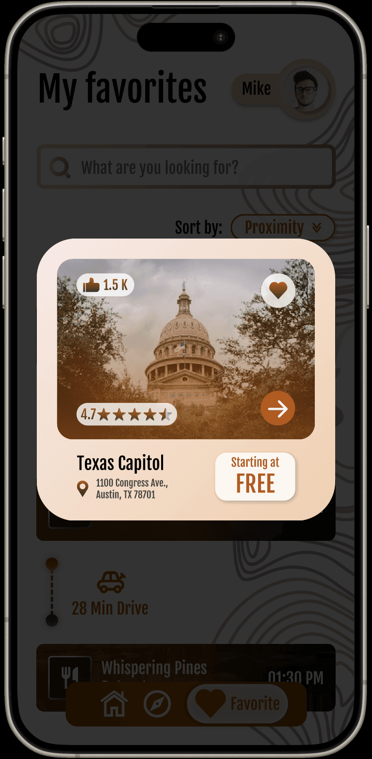
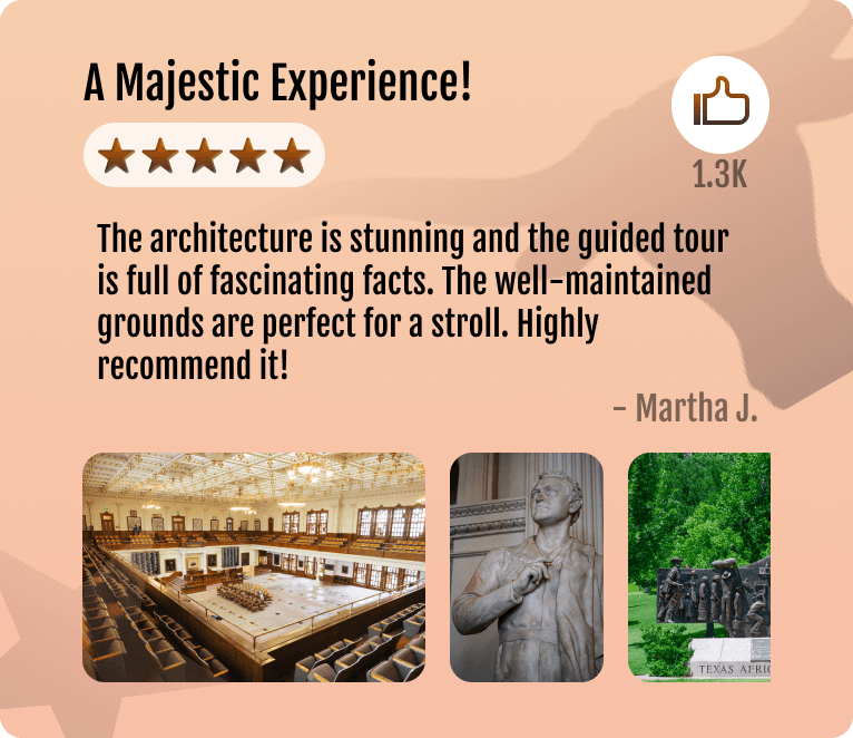
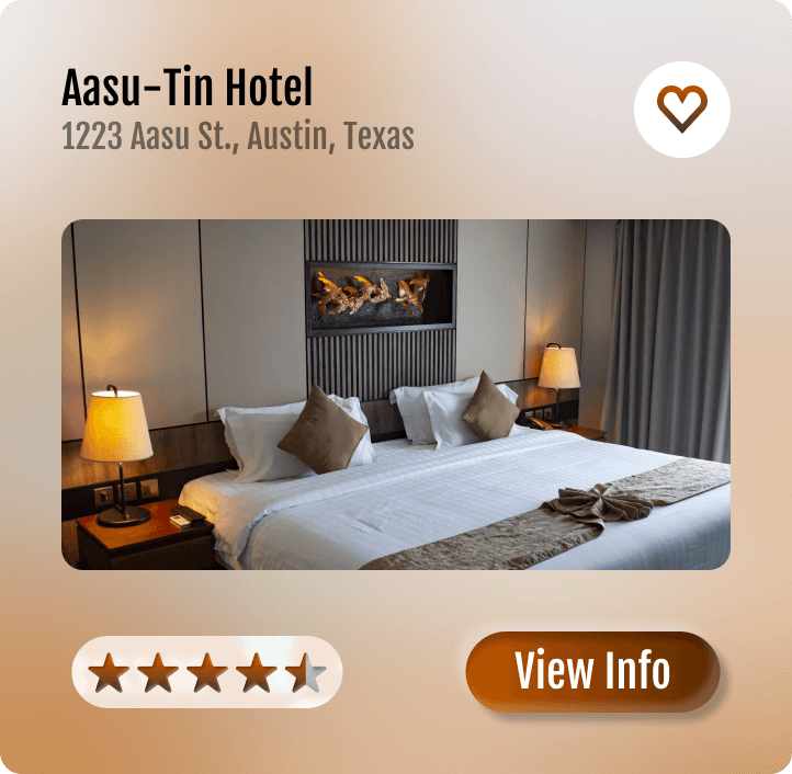
A design for mobile app that recommends a curated selection of Austin's landmark locations. This case study focuses on creating a user-friendly platform that offers personalized suggestions, helping users discover iconic sites and hidden gems. The aim is to enhance the exploration experience for both tourists and locals by providing a comprehensive guide to the city's unique attractions.
user pain points
These challenges were framed based on personal observation and analysis of current travel planning experiences.
02.
Reducing friction from switching between multiple travel information sources.
03.
Adapting recommendations to seasonal relevance.
04.
Creating a simple, intuitive trip-planning flow.
DESIGN


Final result
design system
The design system draws from iconic Austin and Texas symbolism to create a cohesive visual identity. Burnt orange (#BF5700) anchors the palette, reflecting its strong association with Austin through the University of Texas at Austin. The logo is built around an “A” form to represent Austin, combined with a star inspired by Texas’ “Lone Star State” identity. Supporting elements—including a cowboy hat, longhorn, and boot-inspired details—reinforce local culture while maintaining a simple, recognizable structure.


E7FFE6
F6CDAD
F9EAE7
000000
412E32
AB7268
FFFFFF

Fjalla One
Fjalla One


